Have you ever thought about why a lot of fast food logos are red and yellow? Or why financial institutions seem to naturally choose strong, dark blues. It isn’t an accident. Color is a language that speaks faster than words. It bypasses our logical brain and hits us directly in our emotional center. When you are designing custom apparel for a brand, a sports team, or a corporate event, you aren't just picking a "nice shade." You are engineering a feeling. This is a concept that experienced T-Shirts Manufacturers in Australia, like DRH Sports, understand intimately, as they witness firsthand which color combinations fly off the shelves and which ones end up collecting dust in the warehouse. The reality of apparel design is that the fabric color sets the stage for your entire message. Before a customer or a fan reads the slogan across the chest, their brain has already made a split-second judgment based on the hue. If you get the color psychology wrong, you might be sending a signal that contradicts your brand identity. For instance, a law firm handing out neon orange shirts might be trying to look fun, but they could inadvertently be signaling "caution" or "cheapness" instead of "reliability."
The Power of Primary Choices
Let’s break down the emotional spectrum that dictates how we perceive wearable merchandise.
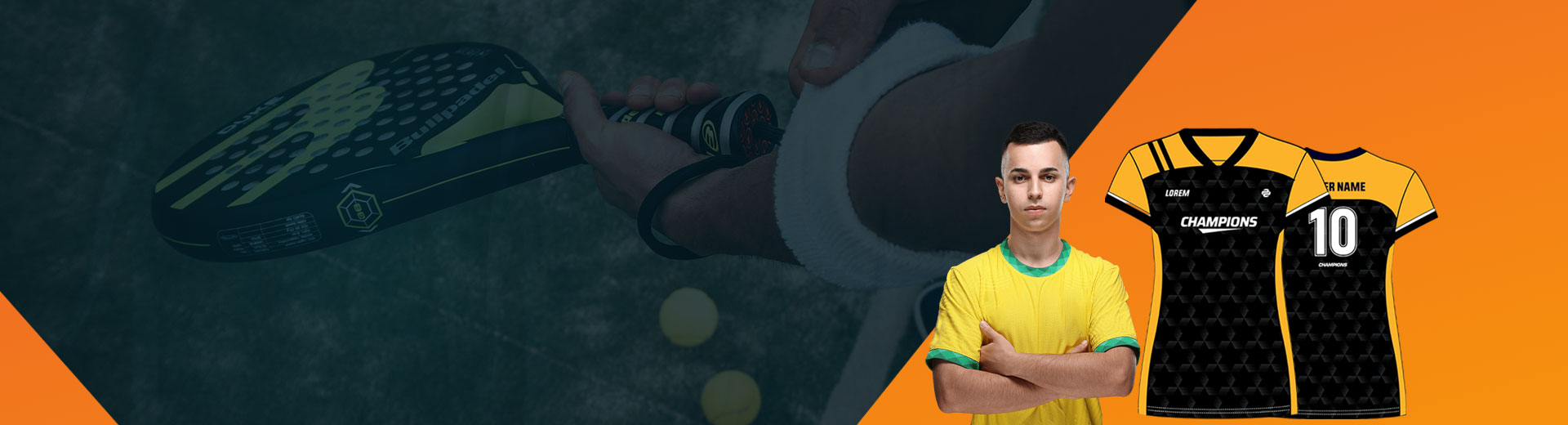
Red is the color of urgency, passion, and energy. It physically raises the heart rate. In the world of sports, red is often associated with dominance and aggression, which is why so many winning teams sport scarlet kits. However, in a corporate setting, it can be overwhelming. A full red polo might be too much for a bank teller, but perfect for a sales team that needs to project high energy and assertiveness. Blue, on the other hand, is the universal donor of the color world. It represents trust, stability, and calm. There is a reason it is the most popular favorite color globally. When you want to foster a sense of community or reliability—think tech support, charity volunteers, or healthcare staff—blue is the safest and most effective bet. It says, "We are here, we are steady, and we are professional." Yellow and Orange are the optimists.
- They scream creativity, youth, and friendliness.
- These are attention-grabbers, but they need to be used with a degree of caution. Because they reflect the most light, they can be fatiguing to the eye if used in large, unbroken blocks without contrasting elements.
- They work best for events that want to project innovation or approachability, rather than authority.
Matching the Vibe to the Fabric
Beyond the basic emotional definitions, there is the practical aspect of how color translates to fabric. A color on a computer screen never looks exactly the same when dyed into cotton or polyester. This is where the technical expertise of your supplier becomes vital. When sourcing your gear, you need a partner who understands that "Navy Blue" isn't just one color; it’s a spectrum ranging from almost black to a washed-out grey-blue. Consistency is key. High-quality T-Shirts Manufacturers in Spain know that maintaining the integrity of a brand’s palette across different fabric batches is essential for professional consistency. If your team runs out onto the field wearing three slightly different shades of green because the dye lots didn't match, it immediately cheapens the look of the organization.
The Context of Contrast
Another tip involves the interplay between the garment color and the print color. High contrast is usually the goal for readability, but "vibrating colors" are a trap to avoid. Have you ever looked at bright red text on a bright green background? It hurts the eyes. This happens because the colors are of similar intensity and fight for dominance. A psychological trick often used in retail is the "halo effect" of white and black. White implies purity, cleanliness, and simplicity. It is the perfect canvas for a complicated logo because it doesn't fight for attention. Black, conversely, implies luxury, authority, and mystery. A black t-shirt with a gold or silver print instantly elevates the perceived value of the item, making it feel more like premium merchandise and less like a free giveaway. These principles are especially important for T-Shirts Manufacturers in France who want to create visually appealing products that stand out in a competitive market while maintaining a premium look and feel.
Cultural and Seasonal Considerations
It is also important to remember that color psychology isn't static; it changes with the seasons and cultural trends. What works in the summer might feel out of place in the winter. Pastels—mint greens, baby blues, and soft pinks—evoke feelings of freshness and are massive hits during spring and summer campaigns. However, release those same colors in the dead of winter, and they might feel flimsy or out of touch. Similarly, earth tones—olives, tans, and rusts—have seen a resurgence recently due to the growing focus on sustainability and eco-consciousness. Brands that want to emphasize their green credentials often skip the literal green and opt for unbleached, natural tones that subconsciously tell the consumer, "This is organic. This is kind to the planet."
Final Thoughts on Selection
Ultimately, the goal of any promotional or team apparel is to be worn. You want the recipient to reach for that shirt not just because they have to, but because they want to. While the logo matters, the color is what coordinates with the rest of their wardrobe. If you choose a jarring, unpleasant color just to "stand out," you might get attention for the day of the event, but that shirt will likely become a rag the next day. By selecting colors that resonate emotionally and aesthetically, you extend the lifespan of your marketing. This is the nuanced advice you should expect when you collaborate with professional T-Shirts Manufacturers in Japan, who can guide you past the trends and toward choices that provide lasting value for your brand.
//